Richard Wicaksono

5+ years of experience in programming and data management. I coded in Python, Java, C++, HTML/CSS, SQL, PHP, and JavaScript. Conducted internships at PT. HK Metals Utama Tbk as a Data Analyst intern and Zi.Care as a Quality Assurance intern.
Currently a Data Conversion Engineer at Nelnet, Inc., creating and developing existing SQL scripts to improve work efficiency and automation. Outside programming, my hobbies include watching and playing soccer, basketball, and badminton.
View My LinkedIn Profile
Data Visualization with Python - Final Assignment
This was the final assignment for Data Visualization with Python by IBM, a course included in the IBM Data Science Professional Certificate program by Coursera. Developed in Python.
Project Details
This was the final assignment for Data Visualization with Python by IBM on Coursera.
There are two parts to this final project:
Part 1 - Create visualizations using Matplotlib, Seaborn, & Folium
This part of the Final Assignment analyzes historical trends in automobile sales during recession periods. The goal is to provide insights into how the sales of XYZAutomotives, a company specializing in automotive sales, were affected during recessions.
Part 2 - Create Dashboard using Plotly and Dash
The objective of this part of the Final assignment is to create dashboards to contain your plots and charts and to provide the directors with the ability to select a particular report or a period of time so they can discuss the data in detail.
Project Outcome
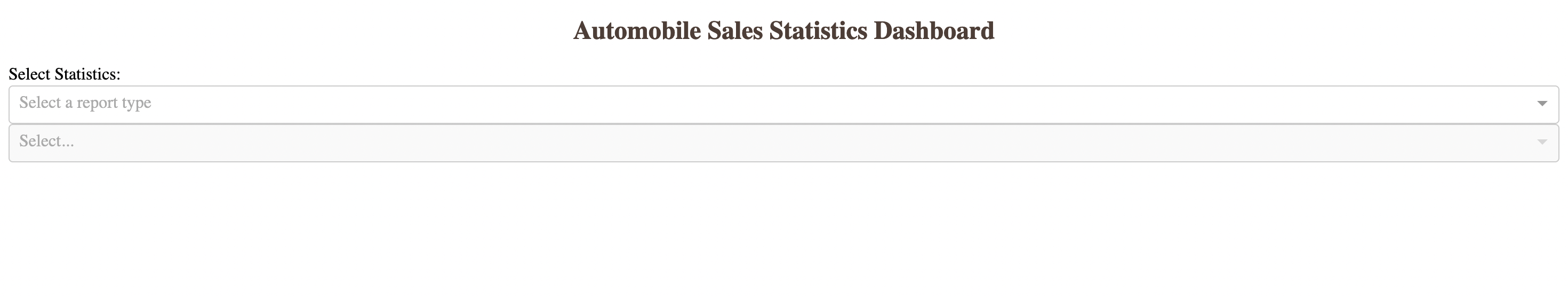
There are two dropdowns that were created. The first dropdown lets users select which report they wish to view: Recession Period Statistics or Yearly Statistics. The second dropdown lets the user select the year the data were recorded. If they chose the Recession Period Statistics report, however, they cannot select the year from the dropdown.
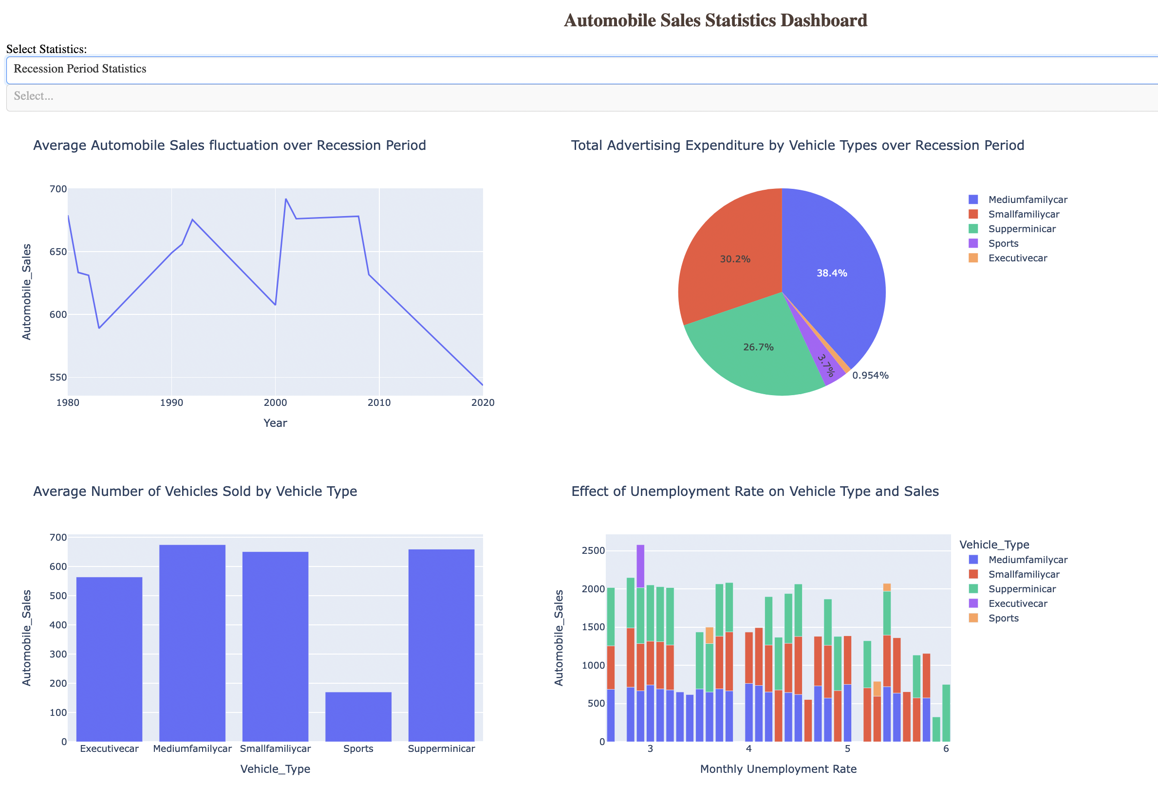
Charts and graphs for the Recession Period Statistics.
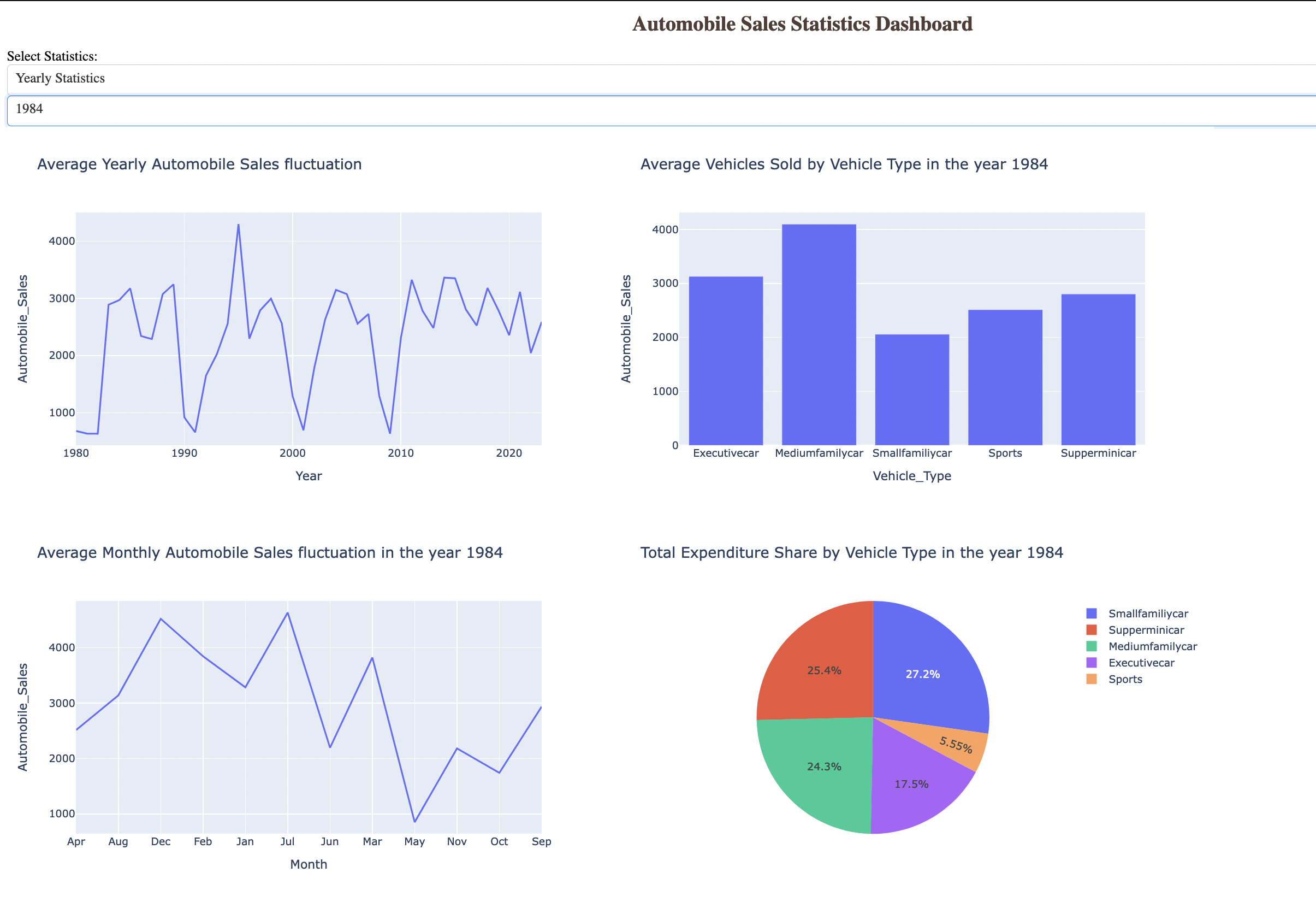
Charts and graphs for the Yearly Statistics report. Users can select a specific year from the second dropdown, and all the graphs and charts will be updated in real-time.
Please click on the buttons below to access the full Jupyter Notebook and the source code for this project.
![]() - Part 1 (Jupyter Notebook)
- Part 1 (Jupyter Notebook)
![]() - Part 2 (Source Code)
- Part 2 (Source Code)